Dan Hilyer said:
Yep, you figured it out, Jim. I finally succeeded in modeling Devon’s brain (http://www.largescalecentral.com/externals/tinymce/plugins/emoticons/img/smiley-tongue-out.gif)
Hey i have seen my brain scans and that isn’t too far off.
Dan Hilyer said:
Yep, you figured it out, Jim. I finally succeeded in modeling Devon’s brain (http://www.largescalecentral.com/externals/tinymce/plugins/emoticons/img/smiley-tongue-out.gif)
Hey i have seen my brain scans and that isn’t too far off.
Main warehouse roof trusses are installed. Still need to add a few purlins but you get the feel of the overall size of the main building. The other two buildings connect on the sides where there is no siding.


Thanks for following along.
Wow! That think is bigger than our “mountains!”
Dan that thing is a monster. An epic build
Well done!
Well, its finally all together, sort of. All the building are complete other than roofing and a few trim pieces, stairs still need to be permanently attached but I doubt I’ll do that any time soon because I need to find a semi-permanent home for this thing before I attach the buildings together along with the stairs.


A little reference on the buildings (photo above): The building on the right with the chimney is the office, the large one in the center is the main warehouse and the small structure on the left is the small warehouse.


I may get a coat of primer on it tomorrow but that’s probably all that will get done before the deadline. The roofing will not get done for sure and I still need to build/print a set of steps for the rear and build a ramp that goes down toward the back on the side of the office. Oh, I almost forgot, I still need to build the jib crane … it never ends.
Hey Dan,(https://www.largescalecentral.com/externals/tinymce/plugins/emoticons/img/smiley-laughing.gif)(https://www.largescalecentral.com/externals/tinymce/plugins/emoticons/img/smiley-laughing.gif)(https://www.largescalecentral.com/externals/tinymce/plugins/emoticons/img/smiley-laughing.gif)(https://www.largescalecentral.com/externals/tinymce/plugins/emoticons/img/smiley-smile.gif)
Dan that is looking spectacular. I particularly like the box of pin-nails. Did you print that too? 
Really well done. The thing I like most about it (besides the obvious and well deserved kudos for the 3D printing approach) are the various buildings and their different roof angles and types. Makes the whole thing very interesting to the eye. When you get it all painted with more contrast between the bits and pieces it is going to look even more awesome!
Jim Rowson said:
Dan that is looking spectacular. I particularly like the box of pin-nails. Did you print that too?
Really well done. The thing I like most about it (besides the obvious and well deserved kudos for the 3D printing approach) are the various buildings and their different roof angles and types. Makes the whole thing very interesting to the eye. When you get it all painted with more contrast between the bits and pieces it is going to look even more awesome!
Thanks for the kind words, Jim. I could have printed the box the pins came in, but don’t think plastic pins would work to well (http://www.largescalecentral.com/externals/tinymce/plugins/emoticons/img/smiley-wink.gif)I used it as a weight to keep the stairs in place since I’ve not attached them yet. The painting part is what I dislike the most. I think I’ve said that before on other builds and it hasn’t gotten any better. I’m not good at it and I just don’t have the eye that some of you do for the colors and weathering. I try, but its just not in my wheelhouse.
Dan I can give it a permanent home
Well then have the wife pick out the colors it should be( I have the same bad eye for colors) and then just let it sit out and weather naturally. This is an awesome looking project and makes me want to get a 3D printer and do things like this.
Dan Hilyer said:
I need to find a semi-permanent home for this thing before I attach the buildings together along with the stairs.
I have just the spot…(https://www.largescalecentral.com/externals/tinymce/plugins/emoticons/img/smiley-cool.gif)(https://www.largescalecentral.com/externals/tinymce/plugins/emoticons/img/smiley-wink.gif)
Dan, it would look good in Oregon(https://www.largescalecentral.com/externals/tinymce/plugins/emoticons/img/smiley-foot-in-mouth.gif)(https://www.largescalecentral.com/externals/tinymce/plugins/emoticons/img/smiley-laughing.gif)
I was thinking that I could add more land and take it off your worry list!(https://www.largescalecentral.com/externals/tinymce/plugins/emoticons/img/smiley-wink.gif)
I’m going to pretend to be an expert here  and give you advice. Feel free to ignore. This is all assuming you are modeling olden days, relatively outback, not fancy.
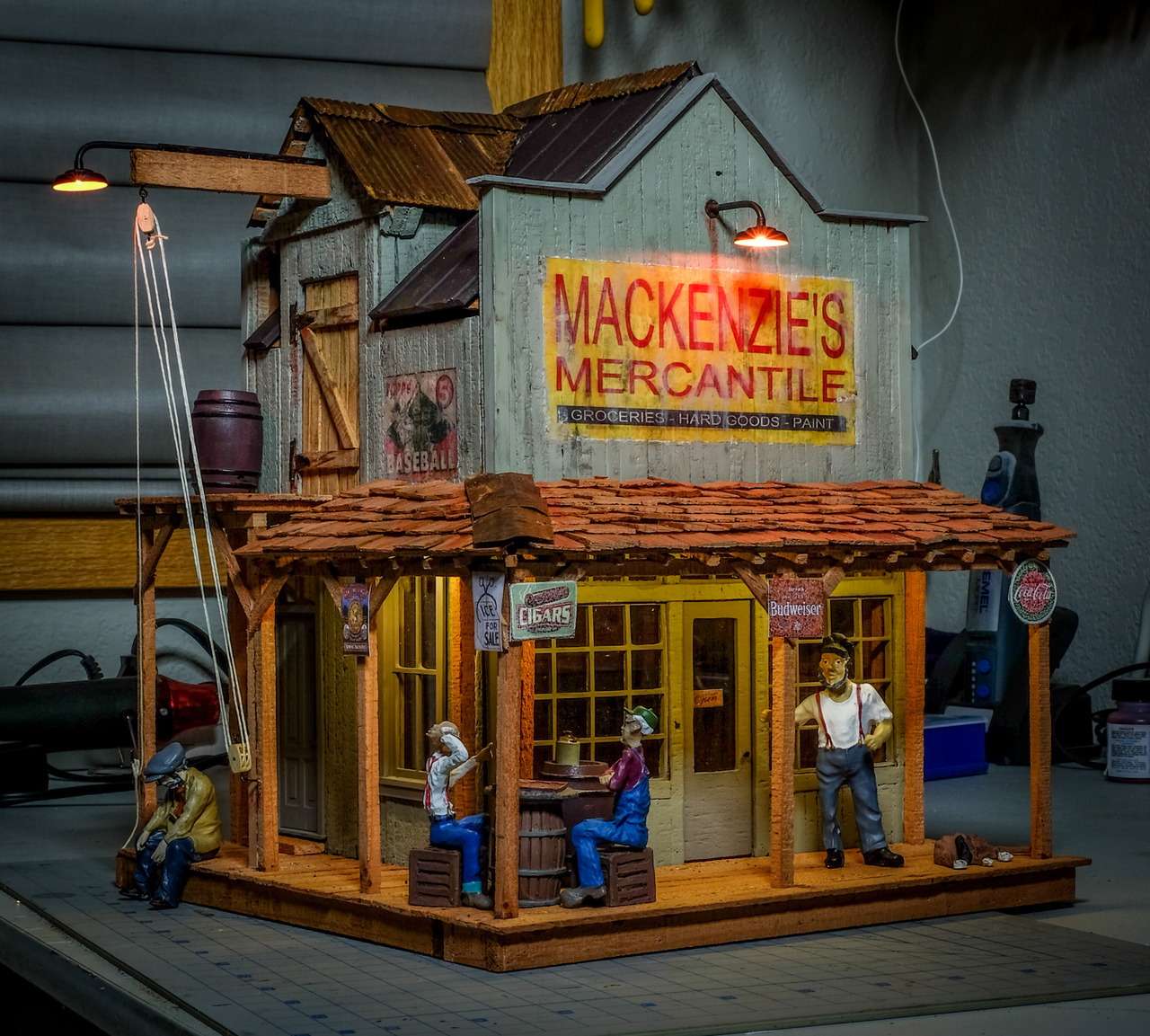
For color selection, Rooster turned me on to the Sherwin-Williams Vintage collection [link]. I used one of those for the color for Mackenzie’s Mercantile (my Mik build from last year):

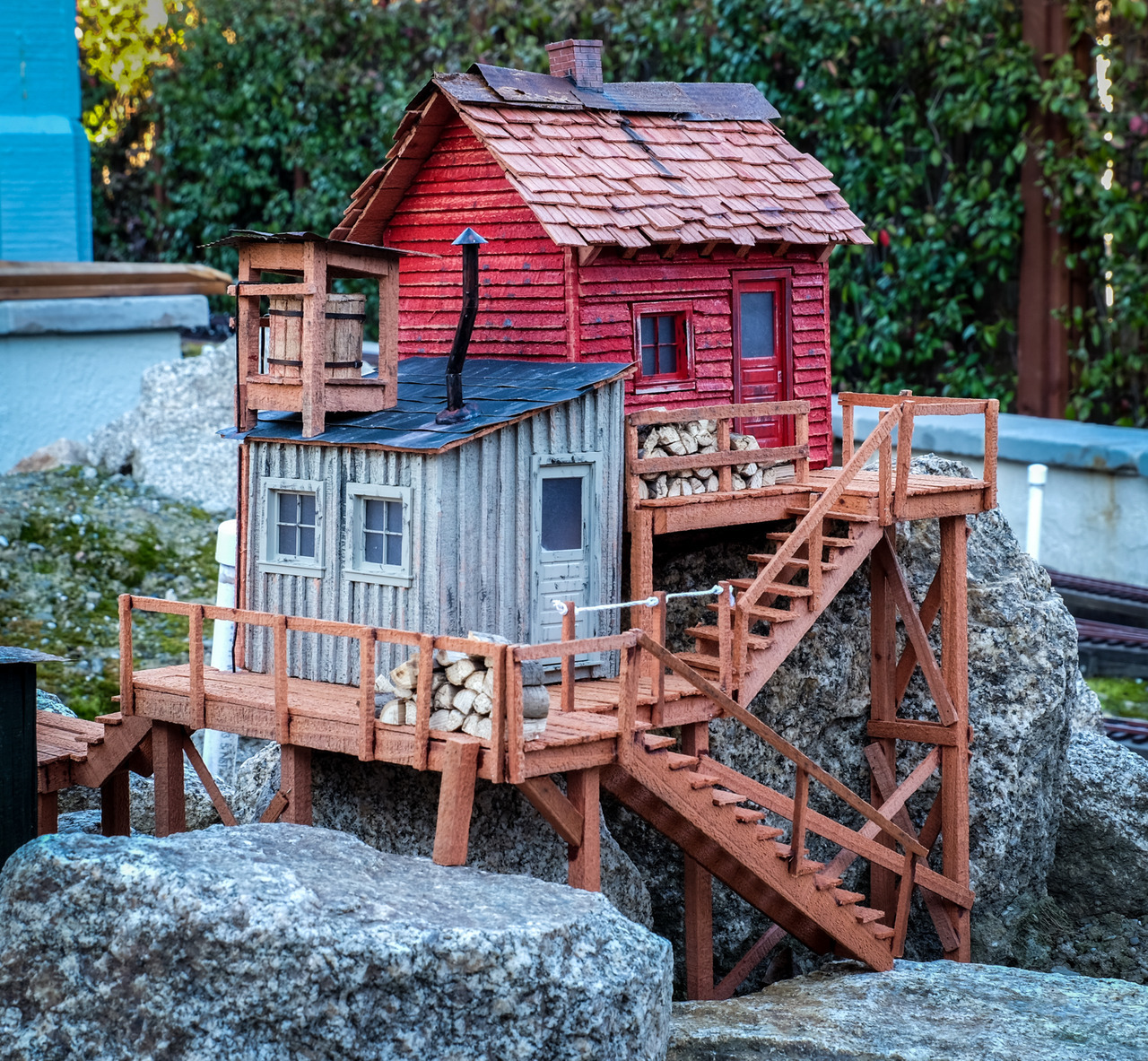
But when you have more than one building, it would be useful, imho, to contrast the colors: light vs dark, warm (orange, red, yellow) vs cold (blue, green, purple). I did some of that in my previous Mik build:

It also seems important to have a variety of different roof types. In both of these I used a mix of corrugated, tar paper, wood shingles, metal. From reading Model Railroader Magazine for decades, it was constantly pointed out that the main thing people see are the tops of things and that making the roof interesting goes a long way toward making the model interesting.
Another rooster suggestion: don’t do any fancy contrasting trim colors (as you would see in a Victorian house) so the trim (door frame, window frame) should be the same as the wall cover. It is good to have some of the doors be a different color (aka plain or stained wood) as that helps with variety.
Anyway, my $.02 if it is useful. Not that I’ve done that many buildings. 
Perhaps others can chime in with their approach.
Great advice, Jim. I’m glad you chimed in when you did because I was headed down an opposite path and I think you have the right idea. Now what colors to choose, hmmmmm (http://www.largescalecentral.com/externals/tinymce/plugins/emoticons/img/smiley-wink.gif)
Here’s a video that I used as inspiration for some of my cliff hanger stuff. May be some colors here that might be useful:
Just a ton of great ideas!
Jim Rowson said:
Here’s a video that I used as inspiration for some of my cliff hanger stuff. May be some colors here that might be useful:
Jim, don’t show me stuff like that, its like showing an alcoholic a fifth of bourbon (http://www.largescalecentral.com/externals/tinymce/plugins/emoticons/img/smiley-tongue-out.gif)Now I want to build every structure in that little village. Great inspiration, thanks (http://www.largescalecentral.com/externals/tinymce/plugins/emoticons/img/smiley-laughing.gif)
Dan, so you want to build more stuff… Mik 2021 is only 10 1/2 months away!