Large Scale Central

CVSRy Herald update

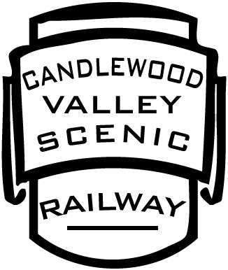
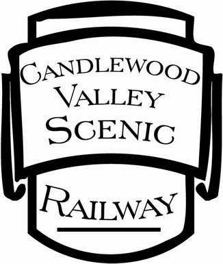
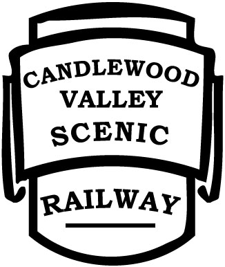
I’ve had a request for CVSRy decals that I couldn’t fill since I never had any made up. Now that I’m working in a sign shop I can get a really good price on vinyl for personal use, so long as it fits in the margins of a paid job. I’m not offering this a a service to anyone else since our shop really isn’t set up for this kind of work. If you want your own decals or vinyl made, please speak to Del Tapparo or Stan Cedarleaf. Cutting small details in vinyl can be a challenge, so I made some updates to my herald to simplify it a bit for cutting. While I was at it I tried some alternative fonts as shown in the last two. I’m still undecided as to which looks best.
Jon,

They all look nice but I rather favor the center one. It’s got the best proportions letter wise I think. The first one does have a very “eastern look” and since you are down east would also look nice although I would downsize “railway” a bit to make it fit better with the other lettering.

Think I’ll second Richard on the center one :slight_smile:

OK…The first one grabbed my eye right away …
So the first one is my choice as I like the font and the way the lettering is laid out with the curvature.

I like the first one, but you have to fix Railway.
It would look better curving the other way like the rest of the lettering.
Ralph

Jon–not sure what you are trying to do, can you 'splain it to me, using small words?

I like the first one, too.

Ralph Berg said:
I like the first one, but you have to fix Railway. It would look better curving the other way like the rest of the lettering. Ralph
Nope I personally disagree ..... I like it how it is

LOL…tied so far at 3 too 3

I like number 2. But its your railroad your rules.

Geoff George said:
I like number 2. But its your railroad your rules.
Tie breaker!

going out on a limb here…I dig #3, and not sure why, 1 & 2 are nice and one is familiar…but I really like #3

cale

It’s been 8 hours. Jon has had enough time to design a fourth, fifth and sixth Herald :smiley:
Ralph

I’d have to vote for Number 2… The C in number one can easily be mistaken for a G, and the 3rd one, the letters are just too ““Squarish””, plus, the words ““Valley”” and ““Scenic”” are more pronounced ““Candlewood””…

Just my 2 cents worth… :slight_smile:

Thanks for all the comments. Still deciding, but I agree with most of the critiques.

Ralph Berg said:
It’s been 8 hours. Jon has had enough time to design a fourth, fifth and sixth Herald :smiley: Ralph

I think I have about 10 hours into this already today. When I attempted to down-size the artwork to actual size for an Fn3 model it got all goofy. So I spent most of the day trying to recreate the outline, which most will recognize came from the EBT. First, I spent almost an hour looking through my archives for a reasonably straight-on shot of an EBT car with a herald. Finally decided on this hopper shot…

(http://www.cvsry.com/sig/EBT_HOPPER_DATA.JPG)

Then I used Photoshop to correct the keystone distortion and remove the black background…

(http://www.cvsry.com/sig/EBT_HERALD.jpg)

And then I removed the East Broad Top lettering leaving just the outline…

(http://www.cvsry.com/sig/EBT_HERALD_OUTLINE.jpg)

This was then brought into Illustrator. Numerous attempts to auto-trace failed, so I spent many hours learning compound shapes. After 3 or 4 attempts I finally settled n this being a reasonable facsimile…

(http://www.cvsry.com/sig/New-EBT-Herald-Outline.JPG)

I think it still needs a few tweaks, but it’s close.

C. Nelson said:
going out on a limb here...I dig #3, and not sure why, 1 & 2 are nice and one is familiar...but I really like #3...

cale


The guy who will be “weeding” the vinyl will agree with you. The serifs are a real pain on small letters.

#2 is my choice. What is the term “weeding”? Is that removing the vinyl that is not used?

I think the words Candlewood, Valley, and Scenic should all be curving the same way. Railway should be straight against the line at the bottom, though you could curve the top of the word.

Bruce Chandler said:
I think the words Candlewood, Valley, and Scenic should all be curving the same way. Railway should be straight against the line at the bottom, though you could curve the top of the word.
Bingo ! The "straight" Valley in no's 2 & 3, I don't like. As well as the "wrong" curve Railway in no. 1. The bird brain has been into the fermented feed :lol: Ralph

Kind of like this…but I don’t have the right software to get the curves correct. Or maybe I have the right software, but not the right knowledge. :wink:

(http://freightsheds.largescalecentral.com/users/thejoat/_forumfiles/CVSR.jpg)

Ric Golding said:
#2 is my choice. What is the term "weeding"? Is that removing the vinyl that is not used?
Exactly. Nearly 80% of the vinyl is scrap. The vinyl around the outside between each letter and the centers of letters like D are weeded out by hand. The smaller and more complex the finished object is, the more difficult this is to do without damaging what you want to keep.