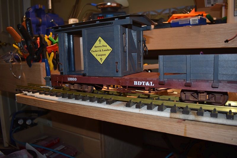
I wanted to continue my work on the work caboose so I am moving over here to finish it up. Here is a link to the build log: Work Caboose. The first thing I want to do is get the logos and lettering added. I think I previously mentioned that I had Stan Cedarleaf print my decals and he did a great job. if any of you are looking for someone to print decals for you, Stan is your man. He was very, I mean very responsive and had the decals in the mail in less than 24 hours from my initial contact. As I told Stan, doing business with him was like a breath of fresh air, very refreshing. Stan is also a sponsor here, so give him a call if you need his services.
Ok, back to the decals. This work caboose and a few other cars I am starting to work on will belong to a small logging line owned by Waverly Southern RR named Brown Dog Timber & Lumber Company. I created 2 logos that are exactly the same except for the general shape. My first task is to decide which one I want to use so I am posting pictures here to get some feedback on what y’all think. Now, I know in the end it is up to me and my tastes, but I really do want some constructive feedback if any of you have a preference of one over the other. First some ground rules: Colors can’t change nor can the fonts, its just a matter of the shape of the logo.
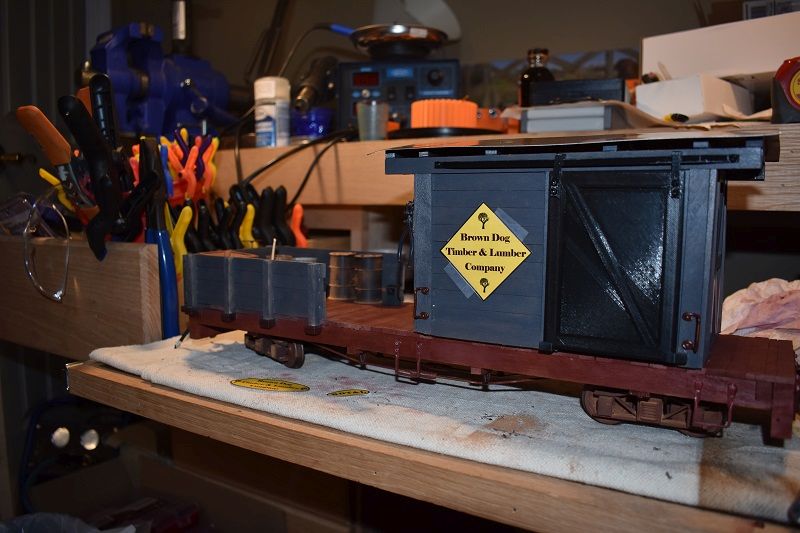
The first one up is the diamond logo. This is the one I prefer, but I have a feeling it will be difficult to place on a lot of cars just due to its size and shape. Also, the logos in the photos below are just paper taped on with scotch tape, so ignore the overall placement and the tape.
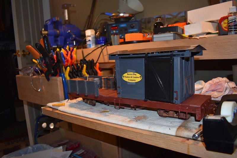
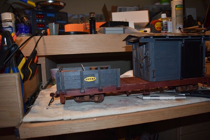
Next is the oval. I think this one will be easier to place than the diamond.
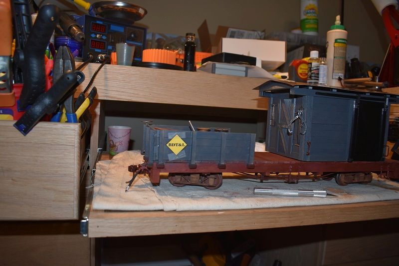
I also created some decals with just the company initials to use in strategic locations or when the full size logos are just to big.
Whatcha think? Any thoughts and feedback is greatly appreciated.
