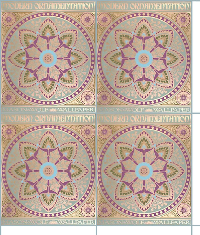
On Ray Dunakin’s website he shows an example of period wallpaper he made up for a building. I thought the idea was pretty cool and Dave Russell chimed in with some links to current manufacturers of reproduction wallpaper in Victorian era styles… http://mason-wolf.com/main.htm http://www.bradbury.com/ Dave asked if I was able to make a paper from the sample images on the web and offered up a link to a Rosette pattern that he liked http://mason-wolf.com/dresser/modorn.htm I know nothing about wallpaper, but I’m pretty sure that this Rosette would not be used alone, but rather as an accent with other patterns. I need input from guys who know about this stuff to take Dave’s request to the next level. When the wallpaper company puts up a sample on the web, they intentionally distort it to make it difficult to do exactly what Ray has done, and I am attemmpting to do with the Rosette below. I found that even after using Photoshop to remove as much distortion as possible, two like images could not be lined up side-by-side with pattern lines matching at both top and bottom. My solution was to add a line between the patterns to allow them to be spread apart far enough that the remaining distortion isn’t as noticeable. This line can easily be made identical to the background color of the pattern so that it disappears. My sample below intentionally points out the line by leaving the ends untrimmed.
I decided to play with the Auto Level command in my JPeg editor. This is what it did…

That definitely kills the period pastel look, but might work in a dimly bit building to accent the pattern. BTW, When printed from the original Adobe Illustrator image, these will be pretty close to scale size of each rosette being 27 inches wide. I’m scaling to 1:24 for ease of calculation.

