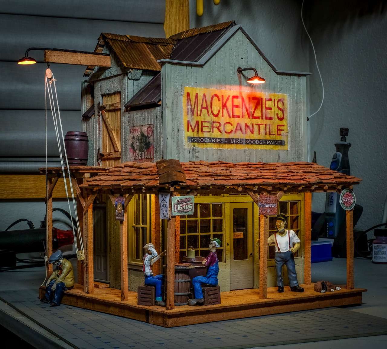
That’s a fine looking building you have created. Great job! It is done enough to get voted on for sure. Don’t cheat us out of that pleasure.
IMHO your colors work well. The green for the doors helps them stick out. The red window frames and railing contrast really nicely with the pale green (or is that tan?) for the siding.
You know, this is nothing to do with your model, but I wonder why they made that little triangular peak at the top of the front wall. Why not just take the regular wall all the way up? Or make that triangle bigger and save the wood. The triangle adds design pizazz for sure, but that seems like a weird thing to spend time on in a boom town.


