Nice roofing job, Jim. I like the mixing of roofing materials.
Jim, wet it with coffee, or tea… Light stain to a brown hemp look…
Lots of great suggestions for me but I’m just burnt out and out of time, so here’s a last photo. Better ones to come for the final submissions:
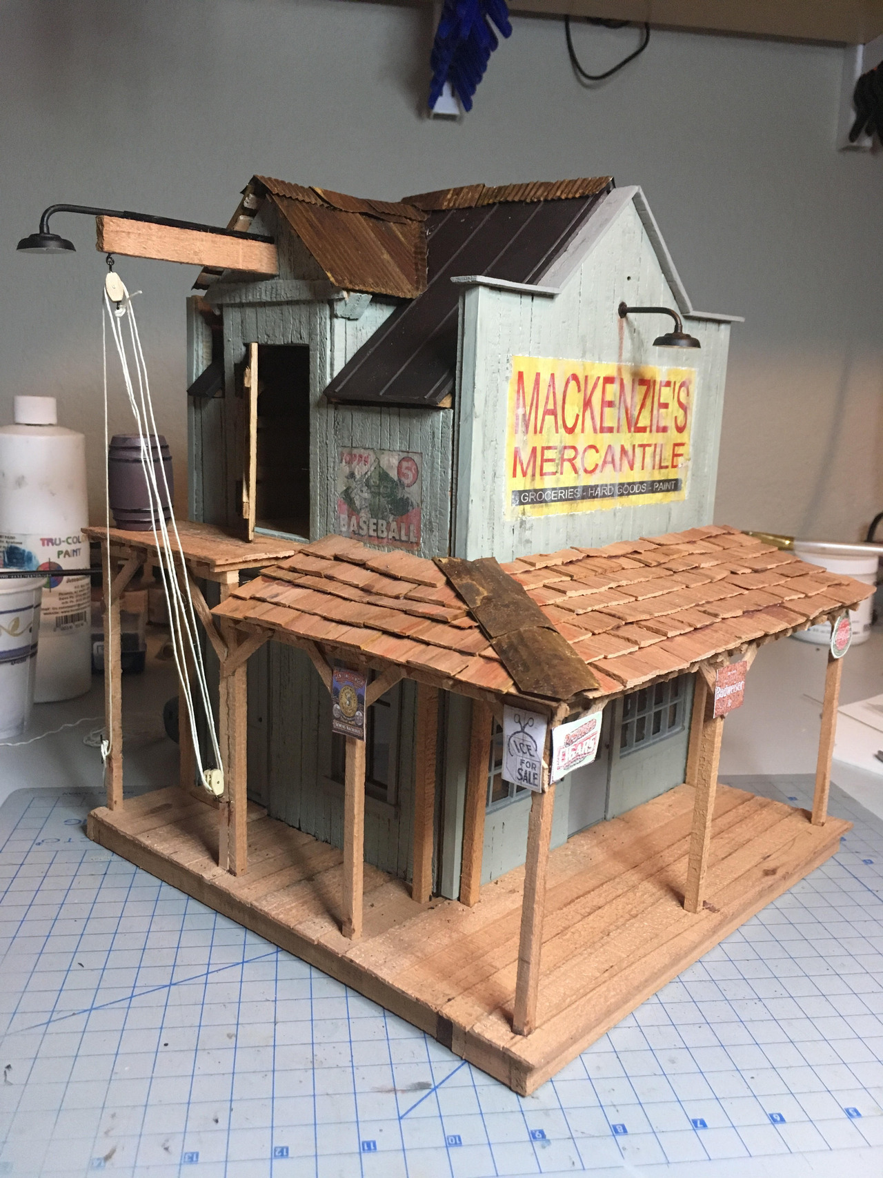
So many great builds this year, lotsa fun to participate. It is interesting how much more engaged builders (and the peanut gallery) are compared to the rest of the year. There’s just something about the shared experience that seems to drive a lot more interaction. Fun!
[edited for typo]
Absolutely great build, Jim. Character from every angle, nice job. I echo your sentiments about how engaging everyone is during the Challenge (including myself). I really look forward to this event each year not only for the building but more so just to be part of the peanut gallery and watch all the excellent projects come together. Already looking forward to next year.
Damn that’s nice
Jim just looked at your glamour shots. Really outstanding work this year. You always do, but this is just a very nice building.
Such a nice job on that building Jim, it looks like it could be 100 years old. I bet your glamour shots will really show it off.
Terrific looking building Jim! Thanks for sharing your building techniques. I really liked the pic you posted of it lit up.
-Jim
Jim Rowson said:
Lots of great suggestions for me but I’m just burnt out and out of time, so here’s a last photo. Better ones to come for the final submissions:
Jim a very beautiful build, love the signage and hope maybe you will do a piece on how they were done, I know you explained in your build but it would be nice if all in one place, again great job, Bill
So many great builds this year, lotsa fun to participate. It is interesting how much more engaged builders (and the peanut gallery) are compared to the rest of the year. There’s just something about the shared experience that seems to drive a lot more interaction. Fun!
[edited for typo]
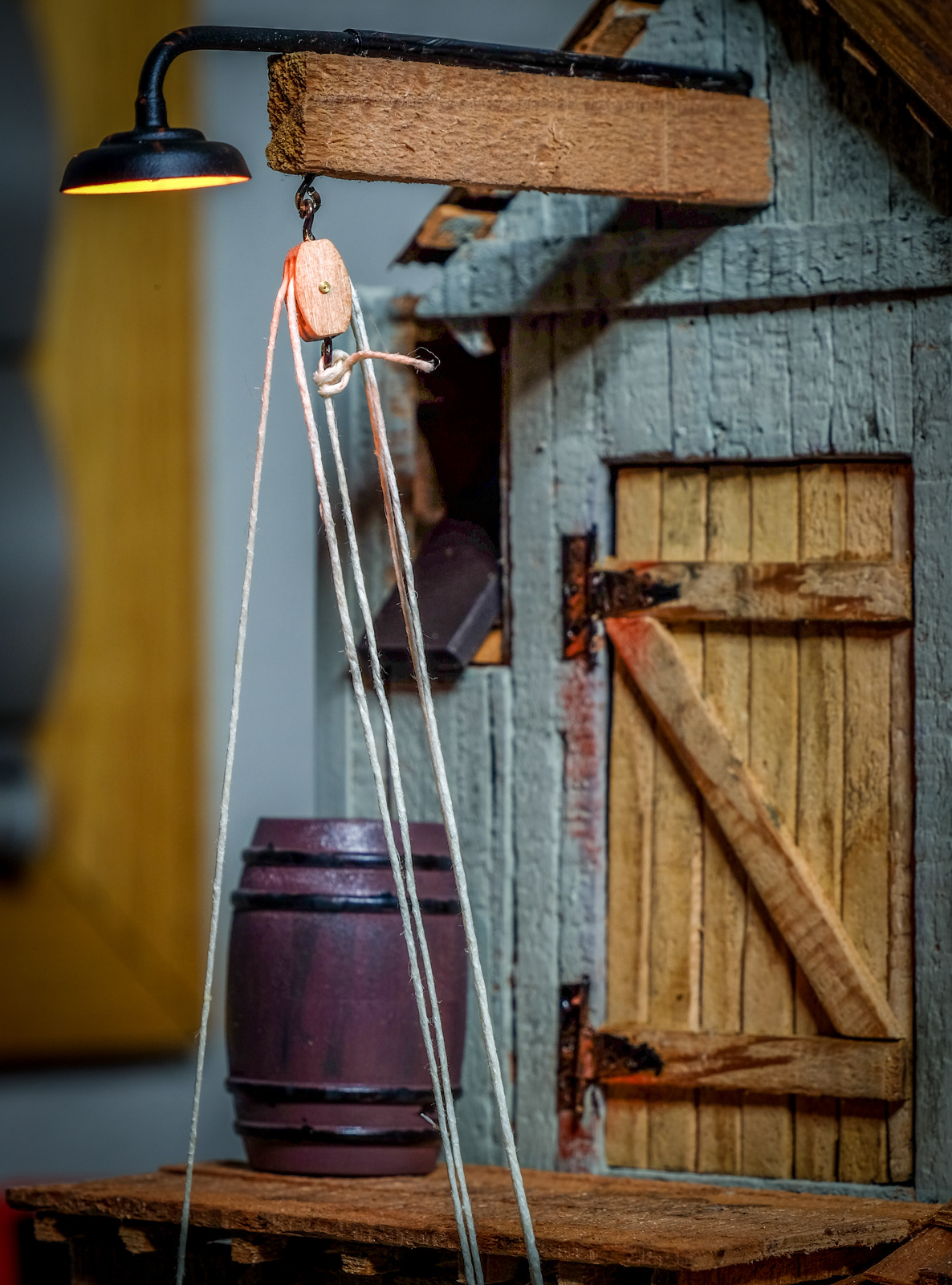
Copying my “glamour” shots here so this topic is all inclusive:
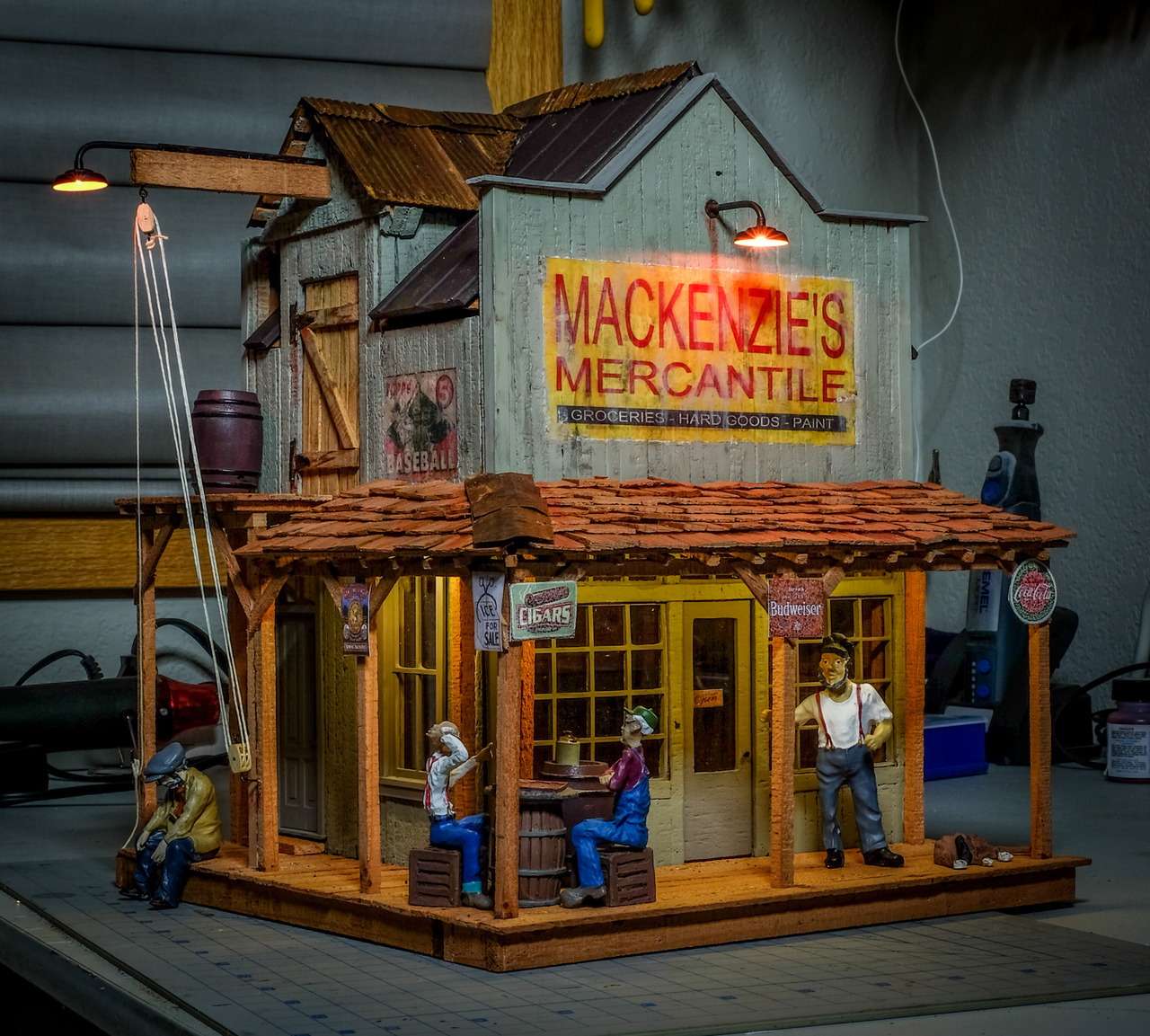
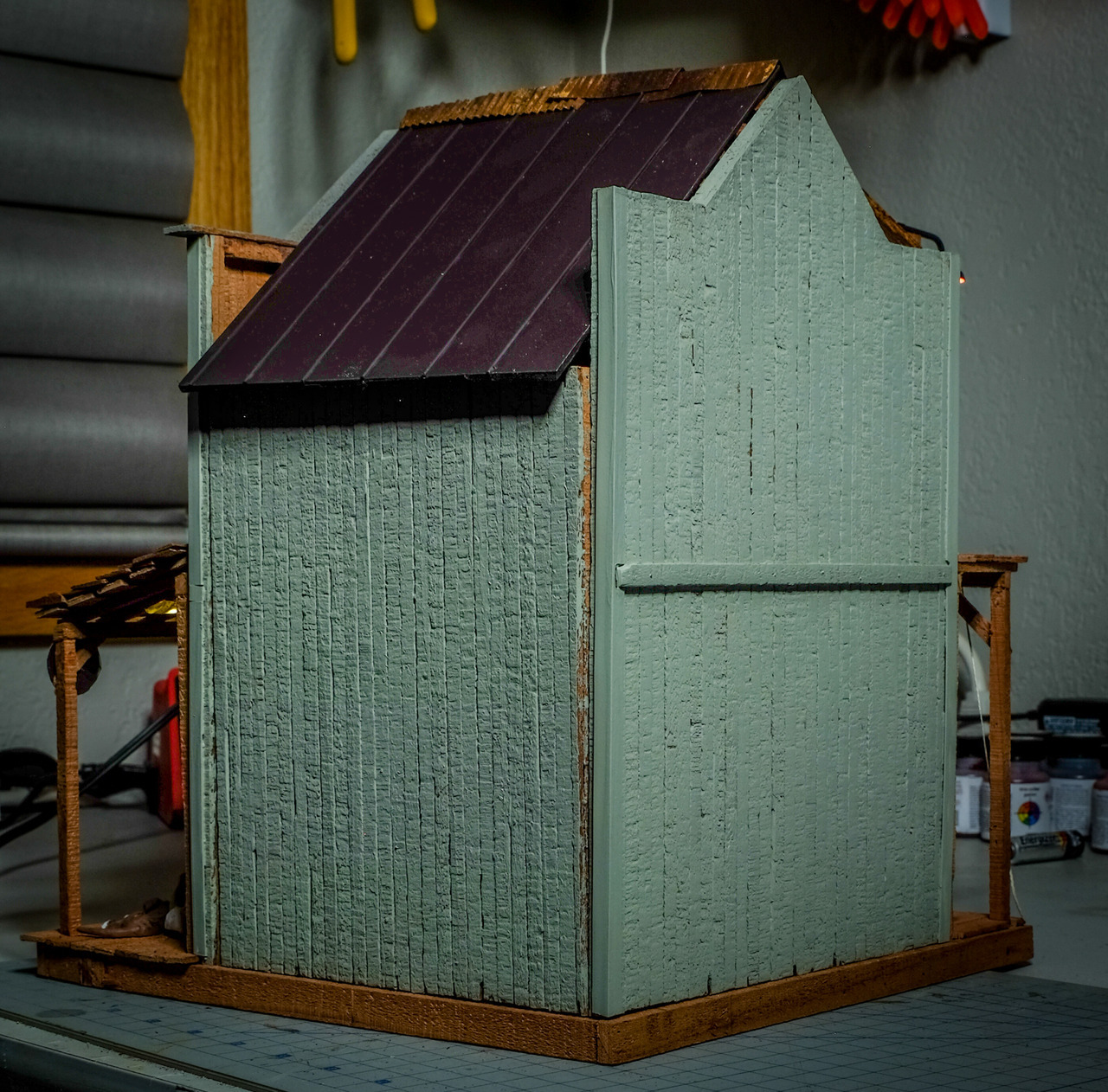
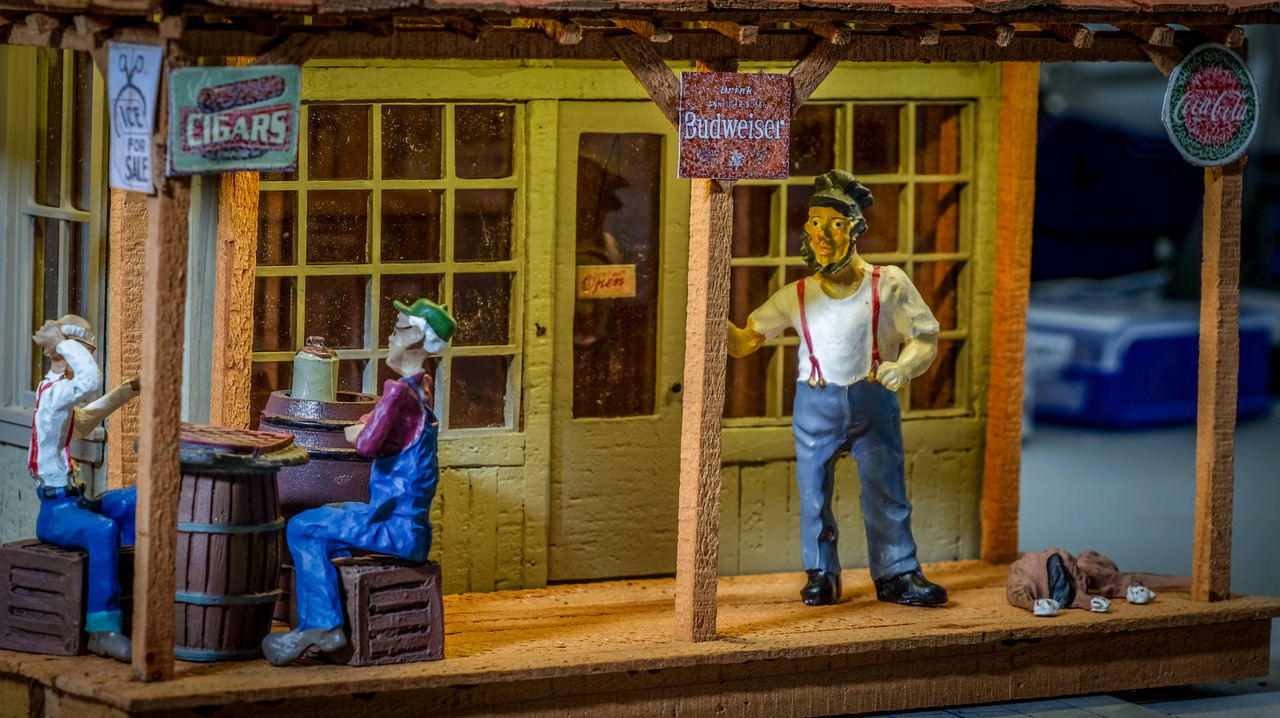
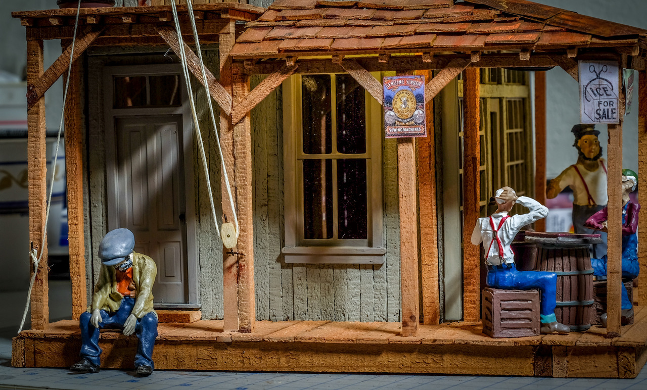
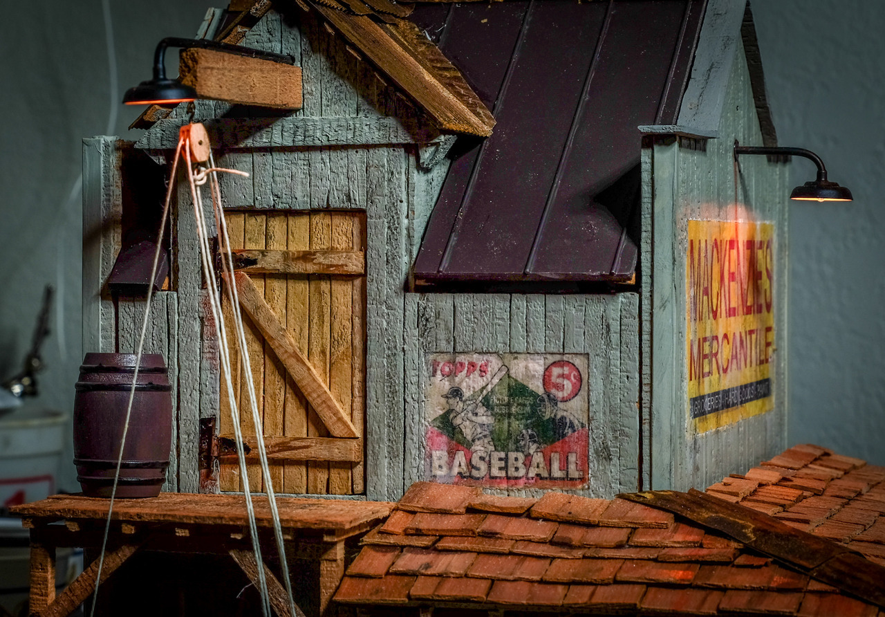
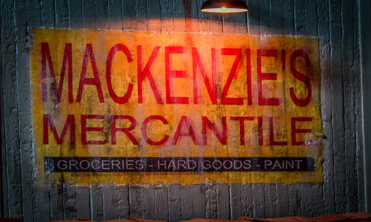
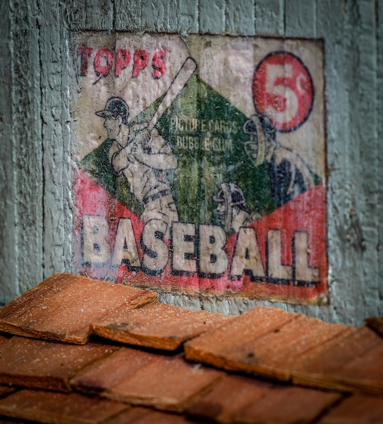
Cheers!
I wont get tired at looking at that.
I know you are not super impressed with the gel transfer but I think they look great. They look aged and weathered as they should
Well, to be fair I think they turned out decently well. Not as much of the underlying texture showing through as I would like. But it does a pretty decent job of transferring a complex image and making it vaguely look like it was painted on. I will use this technique again. Bill asked that I document it more thoroughly and I may do that if there’s enough interest.
Yes please do s little tutorial on it if you would.
That would be very helpful and appreciated, Jim.
Jim, I love the way your signage turned out and would be interested in an sbs on how to accomplish this.
Now to be fair, you also asked me about an sbs on my weathering of the loader so I’ll tell ya what.
You do one and then I will do one, deal?
Deal. Full disclosure: Bill, Devon and Dan had already talked me into it. But I’ll still hold you to your end of the bargain. I’m about to start my own project with a steam engine so I’m needing your technique…
Thanks Jim and Rick. I am looking forward to both how-to’s.
We need more of them. We have some talent here with interesting techniques
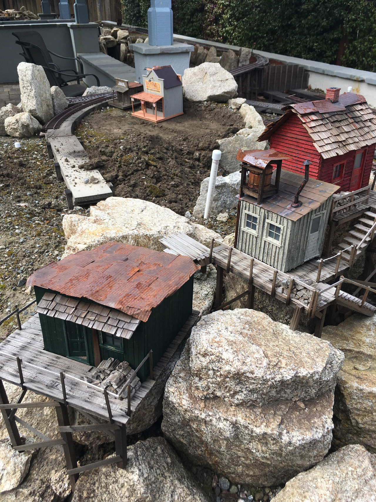
Yeah, I know the challenge is over. Now I’m starting to figure out the placement of this building on the layout. So far I’m happy with what my original plan was (which is good since that is how I chose where to put the details!). Here’s a far away look:
This is closer from where most people will be looking (so down with roofs the most prominent):
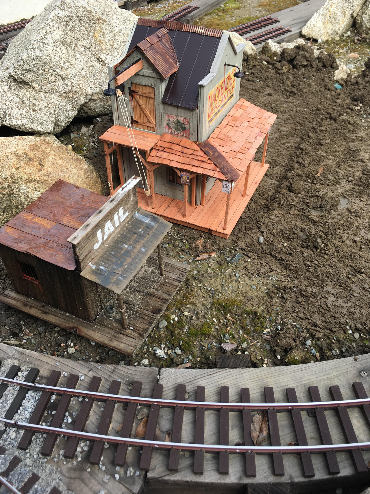
A couple of closer shots. Note that there needs to be enough room to put a delivery truck near the hoist.
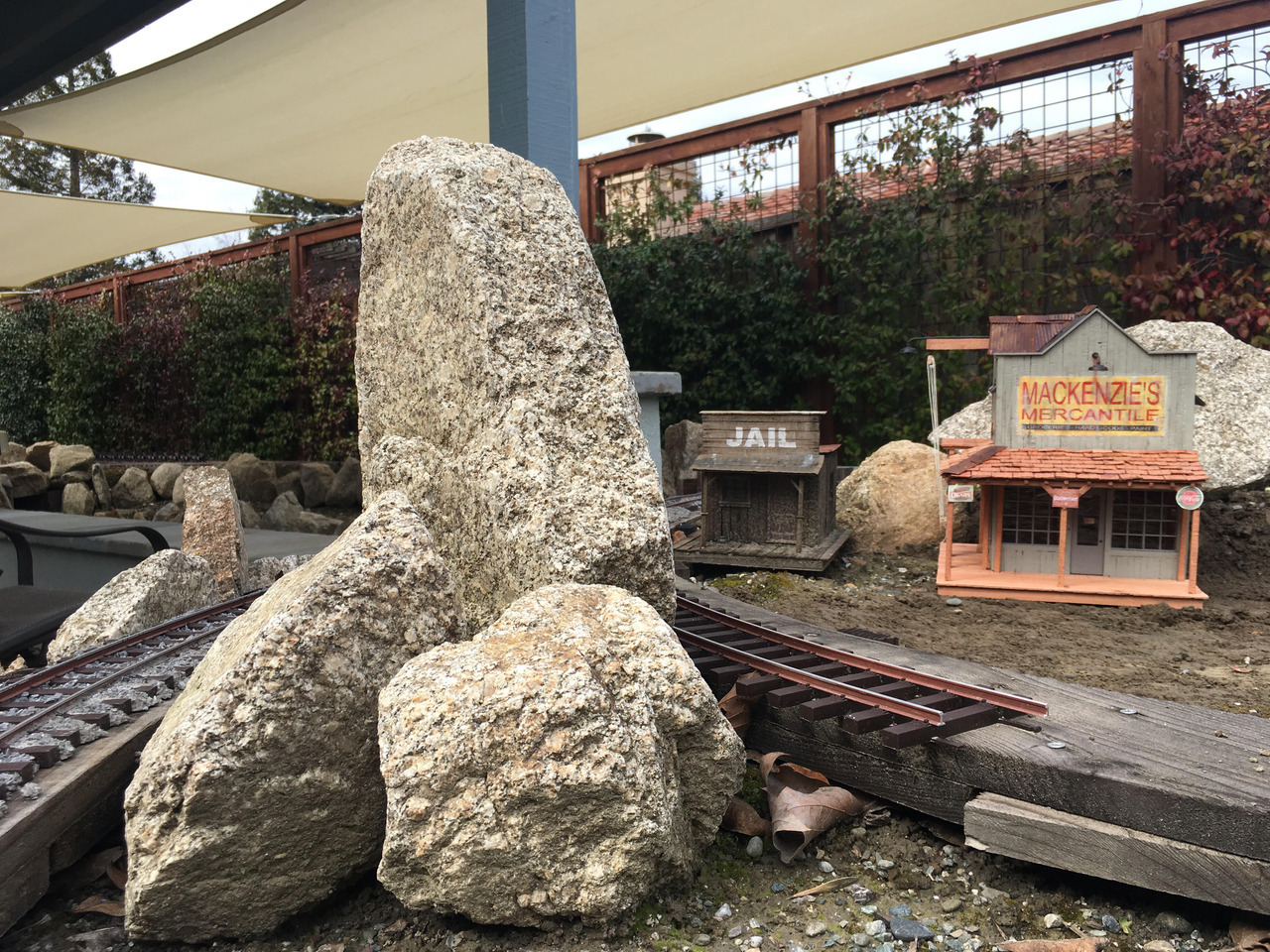
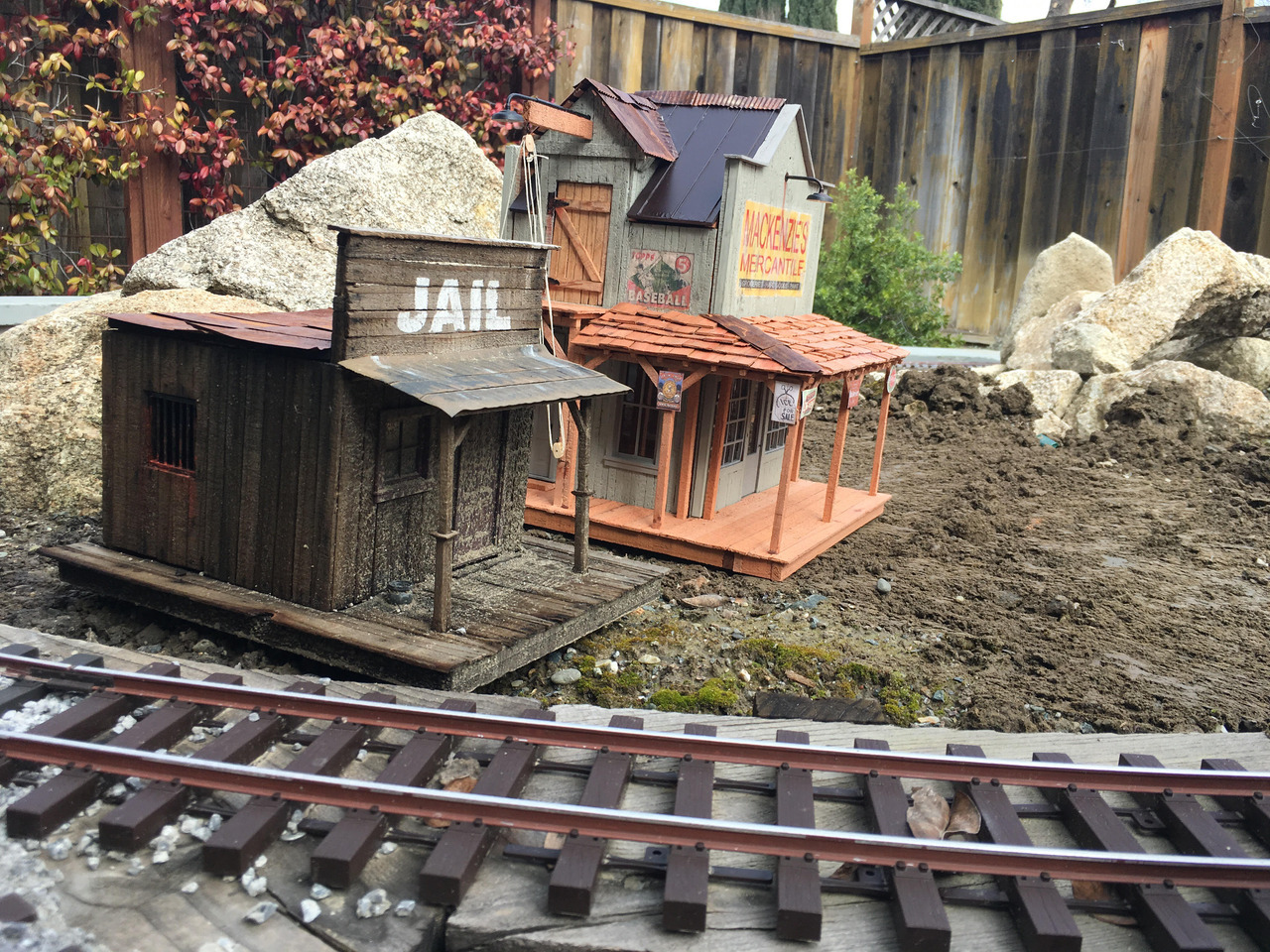
Of course I need to prep this area, get it up to grade, and make the buildings be level. This is just a test fit to see how things look.