Now it is important to remember that this all started with a discussion on making a stone building for storing explosives. If you have not already done so I suggest you read Jim Rowson’s thread: Rock Dynamite Storage House Build
Jim’s thread spawned this thread on blasting and the use of dynamite which you might also want to check out: The Nature Of Dynamite
Then of course Jim wanted to make some crates of dynamite and tried to use the graphics I posted. To which he pointed out that my graphics were low grade cat nuggets and he would have had better luck using silly putty to lift them from his computer screen and use it to print directly on his models… Okay he did not actually say those words but something to that effect implying that he needed a better product.
He then ask if I could supply higher resolution graphics. The answer is a firm maybe. Rather than cluttering up his thread I thought it would be best to write a new one on making this sort of thing.
Rule #1 If Boomer can do it anybody can do it. As always my methods are simple and cheap. Designed for use by cavemen who like me are working with what they got (a ten year old HP inkjet and 50 year old brain). Thus Greg and Maynard being computer geniuses (which by the way is derived from the Arabic word Jinn meaning evil spirits) probably have super graphic programs stolen from Star Trek that can do everything perfectly. Likewise Stan is the undisputed king of decals whom rumor has it, regularly schools Microscale on how to do it right. My friends I openly recognize your superior technology and skill …but it ain’t about that.
Rule #2 Project difficulty is rated by the number of new curse words I have to invent to achieve completion. This is just a one word process.
Caveman huddle…ready… set… smash.
First an explanation of how I make my graphics. The big secret? I use Power Point. It comes with basic Windows, has reasonably good editing capability and I am very familiar with it since the USAF made us use it for all of our after-action reports for over a decade. For the first reason I expect it is available to almost everyone (MAC users you are on your own) and therefore has no additional cost. If you have never read the users guide I suggest you start there, especially the part on photo editing. I am using Windows 10 version, if you have an older version you may need some extra curse words as I am about to explain.
My graphics are a combination of three things: photographs, text blocks and shapes. Used in combination and with a little imagination I have had pretty good luck making both decal and various paper details.
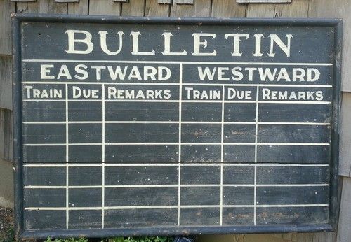
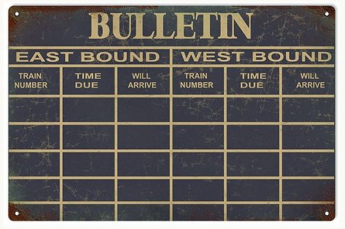
Photographs: You would think these would be super simple. Copy, paste, size, print. Simple right! Well not really. For this to work you have to start with a picture that is perfectly centered on the subject or you will get the fun-house mirror effect. Look at the example below of a sign. The first one will never print properly because the actual shape is distorted. It is photographed from slightly above and to the left. The second sign is straight on and will print perfectly.
So maybe you are not that picky but how about this examples whose extreme viewing angel is much more common? Sorry there ain’t no fixing that.
Now maybe you get lucky once in a while and find something like this. Problem is you are not likely to get all sides to a good resolution with a usable example.
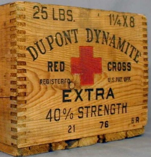
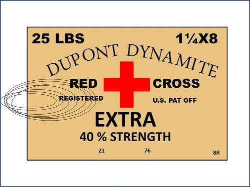
What’s a caveman to do? Make the graphics of course. Let’s start with the DuPont Box since that is the one I wanted originally. I chose it for the exact same reason Jim did, it has some red in it with large lettering and is therefore more appealing to the eye once we shrink it down to scale. First I will need that famous logo.
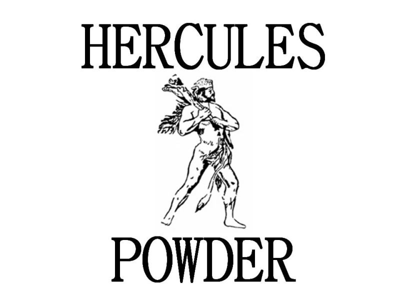
My first effort made ten years ago with PP in Windows 7. It was not as good a program and lacked a key editing feature…no ability to remove the background. I was making printed crates so I could not have a white background. It was fine for decals as the printer does not do white (transparent for decals). It would however show up as a white block in the middle of my wood crates as I had only found white card stock at the time. This meant that I had to find a transparent version of any complex designs I wanted to use such as the DuPont logo or Hercules emblem. On line these were usually vector files or something similar. I could not find any so I made it using the PP shapes and text blocks. I will briefly go through this process even though thank God I no longer have to use it.
Insert circle: change the fill to none (making it transparent). Change the outline to red and increase the weight until the width matched the thickness of the letter font.
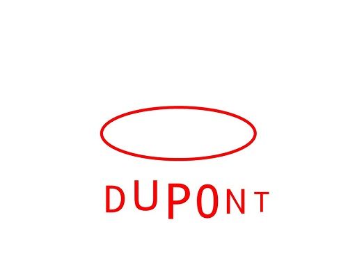
Insert text boxes: Since I cannot curve the letters to match the oval like the real logo I had to use letters in different font sizes. First I matched the text type (Euphemia was the closest). Then I typed each letter in a different size to get the increase and decrease as needed.
Position letters. I ended up doing this with the size and position feature as the arrow keys move the item by .06". You would think that would be exact enough but it is not. I often found that even .01" made the difference. PP by the way works in inches (down to hundredths) as printed. Very handy if you are printing 1 : 1 on a full size sheet of paper and know the real world size.
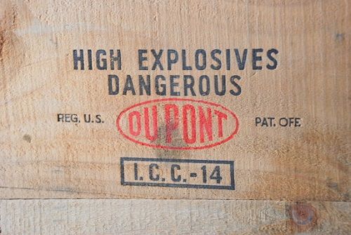
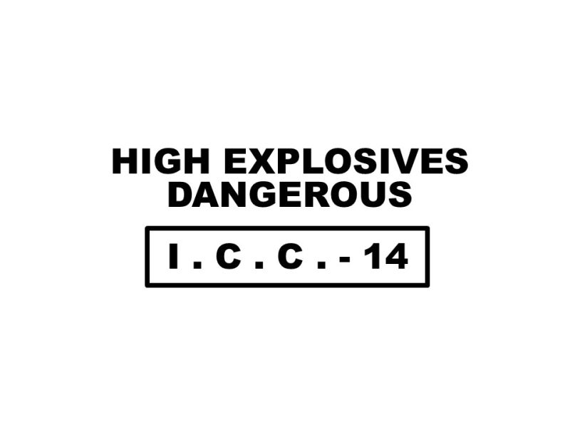
Insert text boxes for the black lettering. Sometimes I used the text in shape feature such as on the ICC marks. This automatically centers the text but you can align it left or right. I added a border using the outline shape and increased the wieght of the line as needed. For the open lettering I used a regular text box where the guidelines disappear once you right click off of it. Here again I matched the text and font size using the box end as a guide. The black lettering is Arial Black.
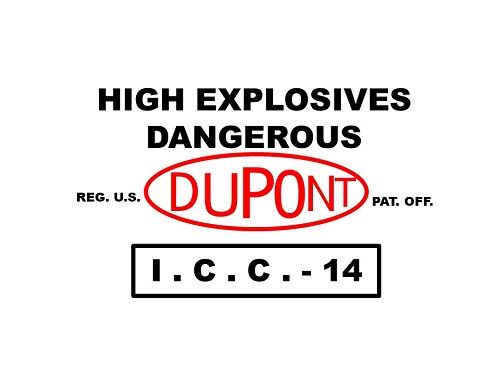
To make the fold-up crates out of card stock I added a colored square with some free drawn lines and circles to represent cracks and knots. The final size had to be proportionate to the lettering so the crate would print the correct size.
To do the other end I used pretty much the same processes. PP won’t do curved writing so I had to do the “DUPONT DYNAMITE” in blocks of two and three letters. You can see it is not a perfect curve.
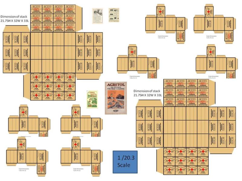
Tops and sides were made using the same technique. Each panel was then saved as JPG file. I cropped these using Microsoft Photo Editor as the resolution is larger and I could see the edges more clearly. I am also using 50 year old eyes. Each picture was then imported into PP and shrunk down as needed, fitting them together for cut and fold as both singles and stacks. It is important to save the panels like this as PP will shrink your graphics but not the text.
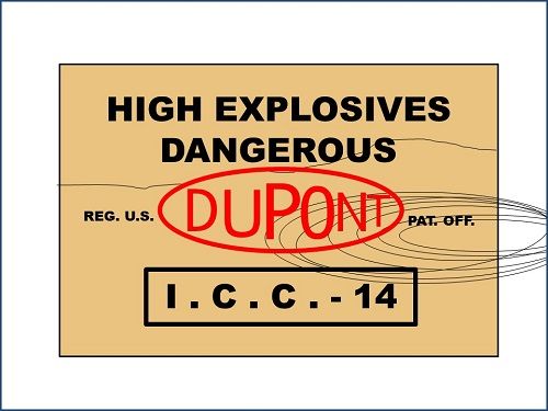
These were all printed on white card-stock and looked okay. After I found tan colored card-stock I did some on that. To help it look more like pine I painted on a rust wash in uneven lines hoping to give it more of a wood tone. Those looked better but still not great.
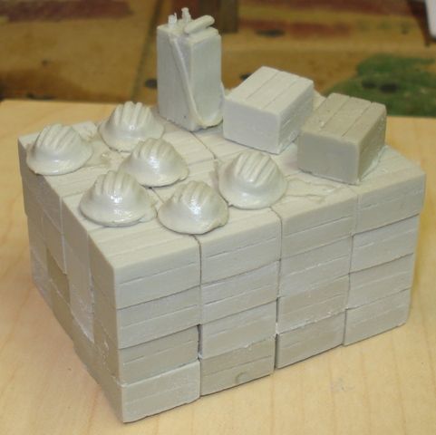
Well the day finally came when I got into casting and made my crates out of resin. Now I needed decals instead of paper
So that brings me to what Jim ask for in the first place, HD graphics.
With the current edition of PP I can rip the logo and replace my original. Still can’t curve the lettering but it is hardly noticeable.
Using PP the largest JPG I can produce is 960 X 720. So here is the largest graphics I can offer. You all will have to try printing them yourselves scaled to whatever size you need.
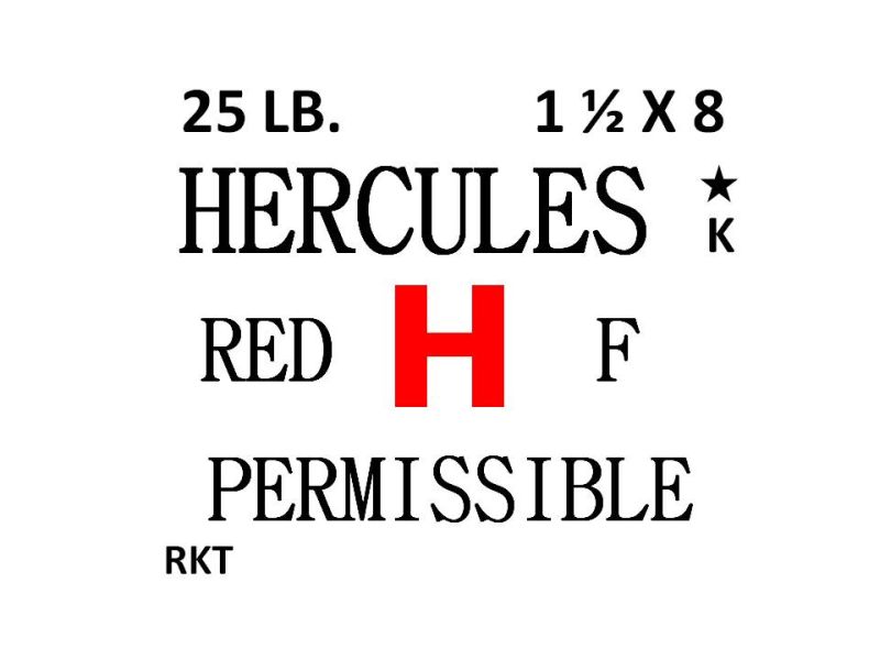
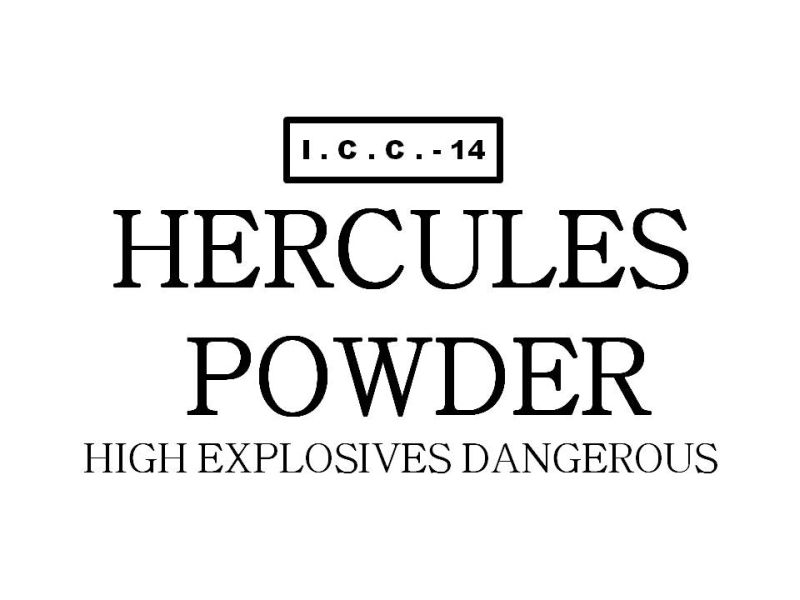
Ends and sides for #25 Hercules Powder:
For the curious the font style for Hercules is BatangChe.
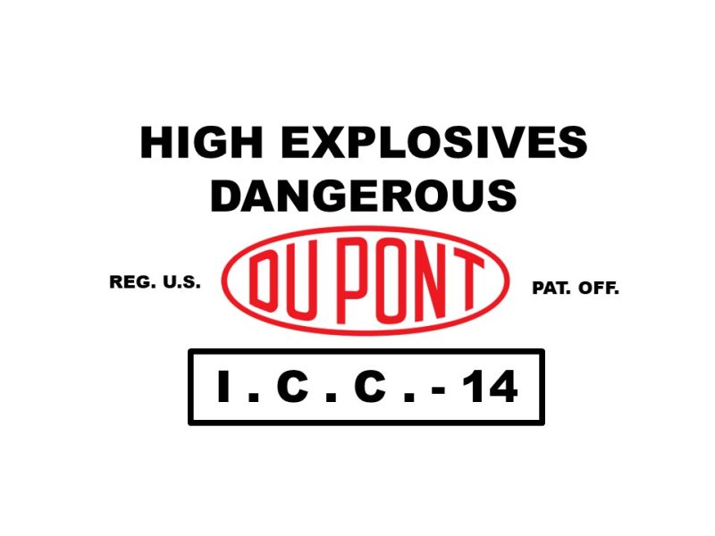
Ends and side for #25 DuPont crate:
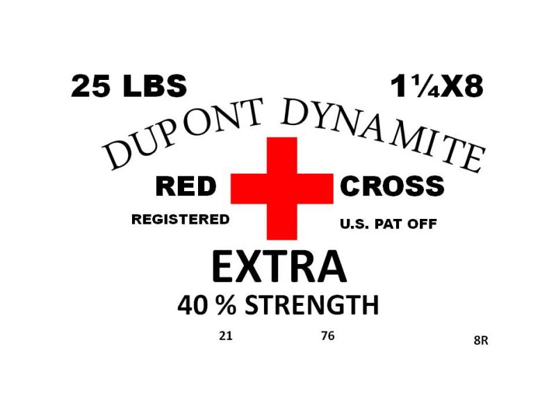
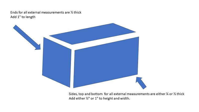
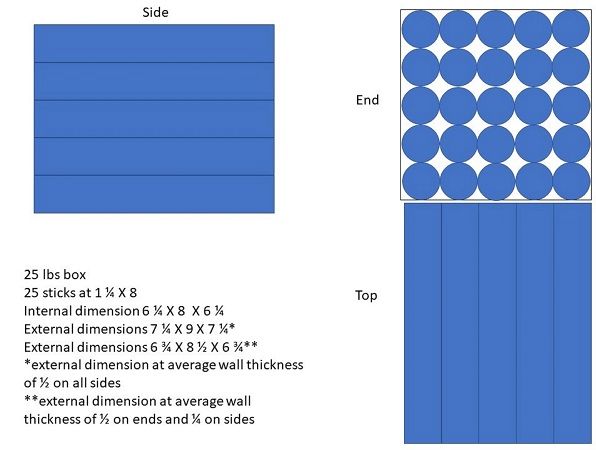
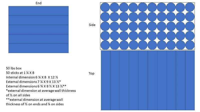
So how big should a crate be? Another grey area. Crates were made with different wall thickness and styles. Some crates were made with finger joints while others had overlapping boards of standard construction. Sticks of dynamite also came in different sizes but 8" X 1 1/4" were standard. These crates would have contained 25 sticks stacked 10 wide in five layers or double that for the 50 lbs version. Notice that the direction of the sticks changes in regards to the markings.
Well that is all for now. Later this week I will post how I made logos and various boxes.


